Abundance Box Plot
Examples
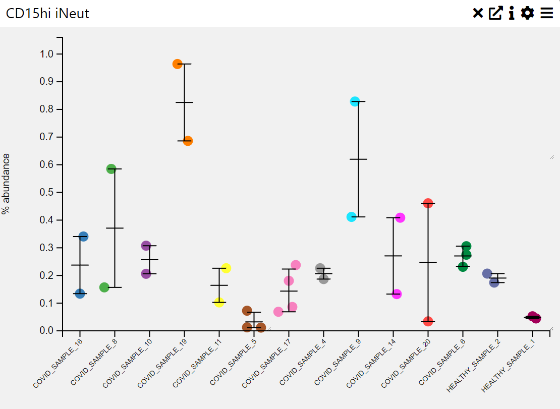
Context
An abundance box plot is used to visualize the distribution of numerical values across different categories, often representing abundance levels in a dataset. It provides insights into the median, interquartile range, outliers, and overall spread of values within each category.
Inputs
- Category (X-axis, categorical variable)
- Abundance Values (Y-axis, numerical variable)
Settings
- Chart Name (customizable title)
- Chart Legend (define or modify legend text)
- Sample Group (choose how data is grouped)
- Sample Selection (filter or choose specific samples)
- Categories (define categorical labels for comparison)
Axis Controls
- Rotate Y-axis labels (toggle for readability)
- Y-axis text size (adjustable via slider)
- Y-axis width (adjustable via slider)
- Rotate X-axis labels (toggle for readability)
- X-axis text size (adjustable via slider)
- X-axis height (adjustable via slider)
Sorting & Display Options
- Sorting Order (default, by size, by name)
- Max Categories (limit the number of displayed categories)
- Hide Zero Values (toggle to exclude empty categories)
- Tooltip Display (enable/disable tooltips for additional information)