Sankey Diagram
Examples
Context
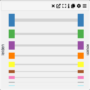
A Group Comparison Chart allows for a visual comparison between two selected categorical groups. This chart is useful for analyzing differences in distributions, frequencies, or statistical summaries across groups.
Inputs
- First Group (select the first categorical group)
- Second Group (select the second categorical group)
Settings
- Chart Name (customizable title)
- Chart Legend (define or modify legend text)
Parameters
- First Group (choose the primary category for comparison)
- Second Group (choose the secondary category for comparison)
Axis Controls
- Rotate Y-axis Labels (toggle orientation for readability)
- Y-axis Text Size (adjustable via slider)
- Y-axis Width (modify width for better label visibility)