Multi-Dimensional Viewer (MDV) Documentation
Summary
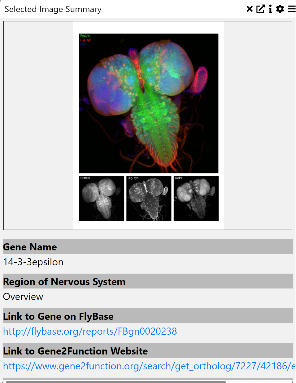
Multi-Dimensional Viewer (MDV) enables the user to visually inspect and query the underlying data from omics experiments such as scRNA-seq, scATAC-seq, spatial transcriptomics, and spatial proteomics. Users can upload tabular data (.csv/.tsv), AnnData (.h5, .h5ad), or image files (.ome.tiff) and interactively filter, sort, and visualize them.
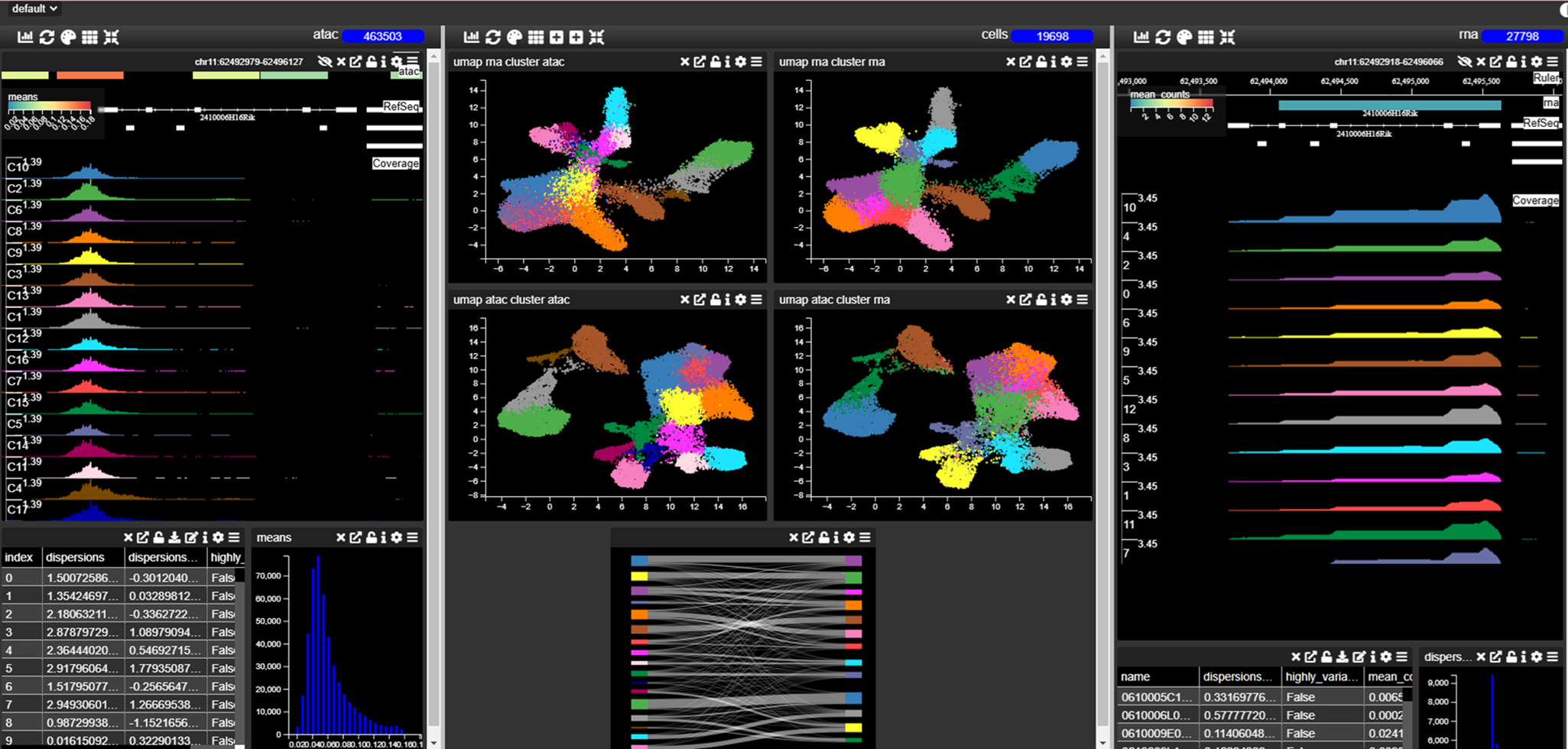
Each MDV project consists of multiple Views, which contain tables of data that can be queried and visualized. Views can be thought of as dynamic slides in a presentation, helping users tell a story with their data using various visualization tools.
Creating a Project
Uploading Data
Supported File Types
Tabular data: CSV (.csv), TSV (.tsv)
AnnData files: H5 (.h5), H5AD (.h5ad)
Image data: OME-TIFF (.ome.tiff)
Uploading a File
Navigate to your created project.
Drag and drop the file into the upload box.
Preview the file contents and click OK to upload.
Large files (>2GB) should be uploaded via the API.
Once uploaded, the data is displayed in appropriate views:
Tabular data appears as a single table.
AnnData splits into a cell table and gene table.
Images appear in the image viewer.
Saving a Project
When tracks, graphs, or columns are added and you have edit permissions, they are permanently added to the project. However, layout changes (resizing, repositioning) are not saved automatically.
To save these layout changes:
Click the Save button (
 ).
).If working on a public project, select Save As to create your own copy.
Views
Views are the canvas that you add your charts to. You can access all the available views in the drop down filter at the top left of the MDV project window ( ).
If your screen is getting very crowded with charts, then add a new view.
).
If your screen is getting very crowded with charts, then add a new view.
Adding a View
You can add or delete a view using the + or - buttons next to the Select View drop down menu. When you do this MDV will ask you if you want to save the view (as a reminder, in case you need to save your work) as you will be moving to a new View and anything not saved will be lost. Then it will give you options to Clone the current view which will allow you to make a copy of that View complete with the underlying data and charts. It will then switch to that View.
Adding Graphs/Charts
Charts help visualize data and allow intuitive filtering by selecting regions on plots or interacting with chart elements. Each filter automatically updates all charts, the table, and the browser to reflect the filtered data.
Move charts by dragging the title bar.
Resize charts using the icon at the bottom-right corner.
Remove charts with the trash icon.
Adding a Chart
Click Add Chart.
Select a Chart type.
Choose the fields to display.
Name the chart.
Adjust settings using the gear icon (
 ).
).The palette icon is used to select channels with spatial omics data (
 ).
).
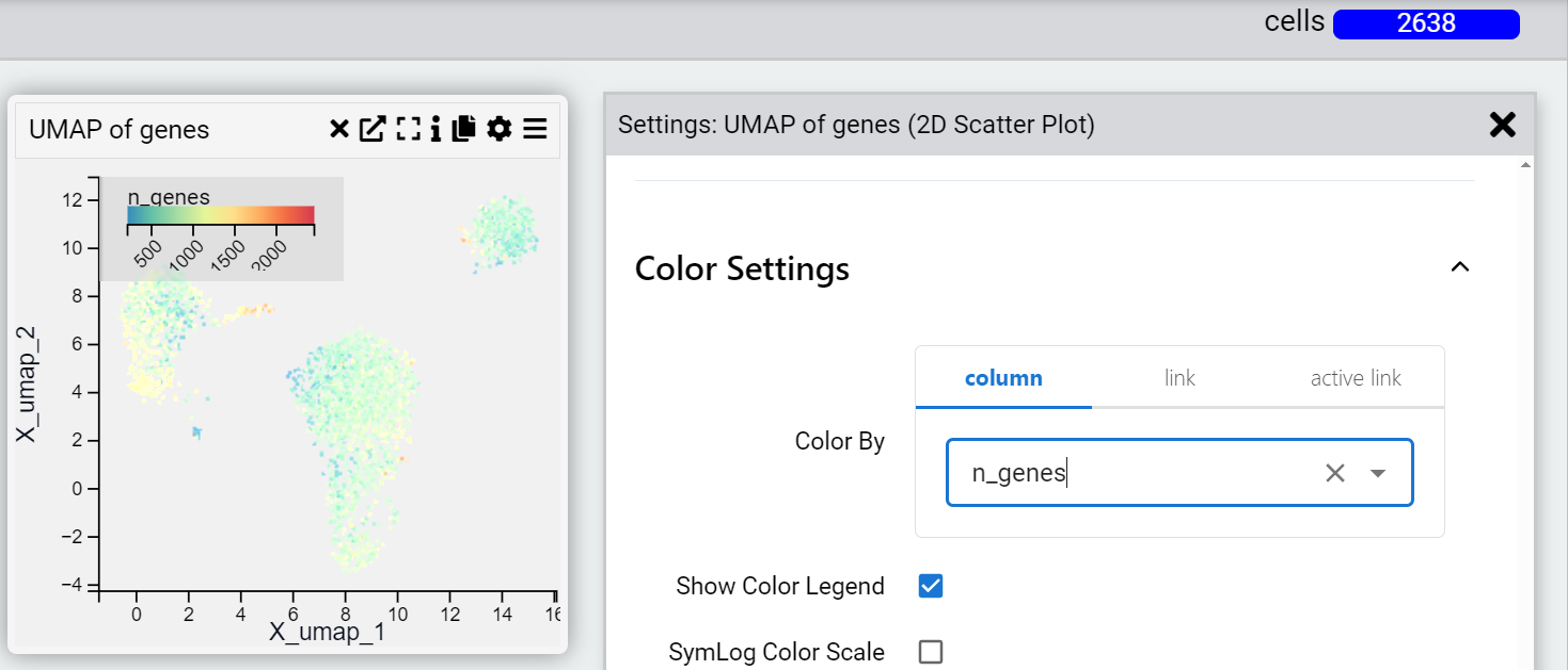
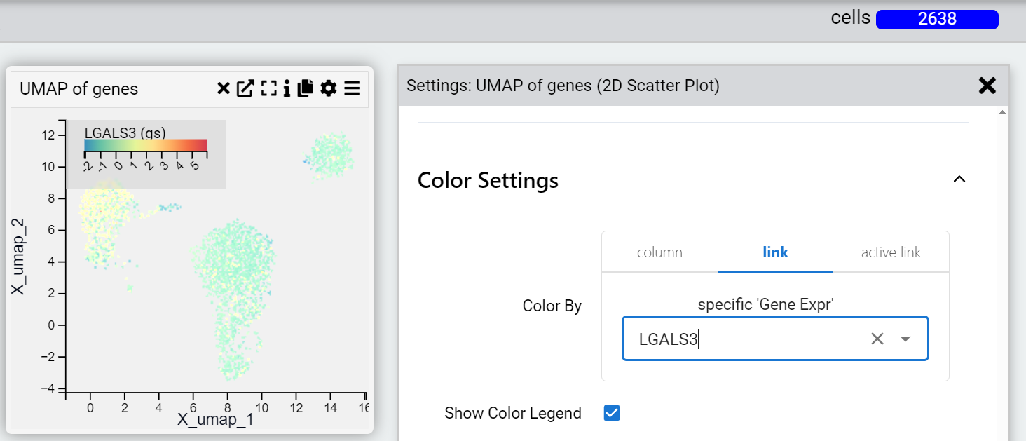
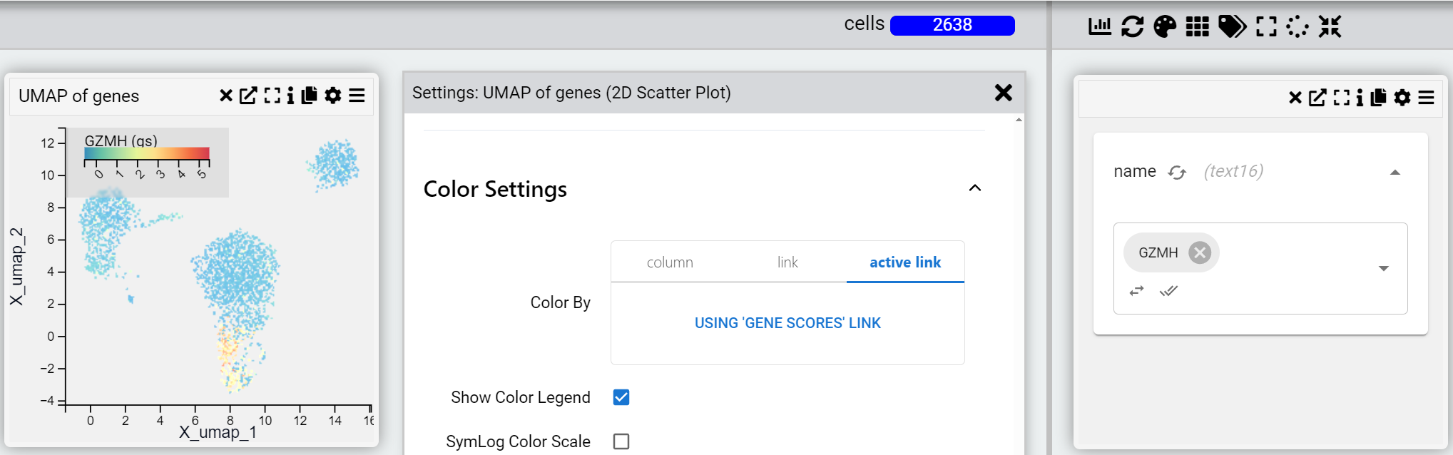
Settings
Each chart may be customized in settings. Chart settings allow you to change properties such as title, description and which axes. There are often many options to change the underlying data and look and layout of the chart.
Furthermore, for when changes axes it is possible to refer to a:
Column in the same table
Link to a column in another table
Dynamically link to a column in another table
For example, a scatterplot is made based on the values of the column UMAP_1 and UMAP_2 in the “cells” table of an anndata object. The points in the UMAP maybe be coloured to reflect using the “Color by” setting to reflect:
A property in the “cells” table.
The expression value of a particular gene in the “genes” table
The expression value of a particular gene in the gene table that automatically updates when you change the filter. You can also add multiple genes in the “genes” table and where the chart can display it (for example a dot plot of gene expression) you will see all the genes dynamically added to the chart.
Supported Chart Types (Alphabetical)
Below is a list of all chart types in alphabetical order, with context (what each chart is typically used for), inputs, settings, and hyperlinks to example images stored in the img/ directory.
Abundance Box Plot
Examples
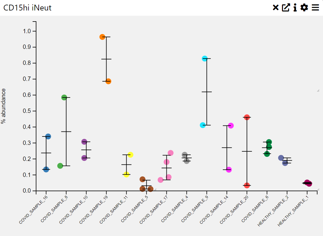
Context
An abundance box plot is used to visualize the distribution of numerical values across different categories, often representing abundance levels in a dataset. It provides insights into the median, interquartile range, outliers, and overall spread of values within each category.
Inputs
Category (X-axis, categorical variable)
Abundance Values (Y-axis, numerical variable)
Settings
Chart Name (customizable title)
Chart Legend (define or modify legend text)
Sample Group (choose how data is grouped)
Sample Selection (filter or choose specific samples)
Categories (define categorical labels for comparison)
Axis Controls
Rotate Y-axis labels (toggle for readability)
Y-axis text size (adjustable via slider)
Y-axis width (adjustable via slider)
Rotate X-axis labels (toggle for readability)
X-axis text size (adjustable via slider)
X-axis height (adjustable via slider)
Sorting & Display Options
Sorting Order (default, by size, by name)
Max Categories (limit the number of displayed categories)
Hide Zero Values (toggle to exclude empty categories)
Tooltip Display (enable/disable tooltips for additional information)
Box Plot
Examples
Context
A box plot is a visualization used to summarize the distribution of numerical values across different categories. It highlights key statistical metrics such as the median, quartiles, and outliers, providing insights into the spread and variability of the data.
Inputs
Category (X-axis, categorical variable)
Value (Y-axis, numerical variable)
Settings
Chart Name (customizable title)
Chart Legend (define or modify legend text)
Band Width (adjustable width for distribution smoothing)
Intervals (control the number of divisions in the data representation)
Point Opacity (adjust transparency of individual data points)
Point Size (set size of data points for better visualization)
Axis Controls
Rotate Y-axis labels (toggle label orientation for readability)
Y-axis text size (adjustable via slider)
Y-axis width (modify axis width for layout optimization)
Rotate X-axis labels (toggle orientation for better fit)
X-axis text size (adjustable via slider)
X-axis height (modify spacing to accommodate longer labels)
Color Settings
Color By (choose a variable for color encoding)
Show Color Legend (enable/disable color legend)
SymLog Color Scale (apply logarithmic scaling for better contrast)
Trim Color Scale (adjust percentile range for color mapping)
Treat Zero as Missing (exclude zero values from visualization)
Tooltip & Interaction
Show Tooltip (enable or disable tooltip display)
Tooltip Value (choose which information appears in the tooltip)
Centre Plot (reset and centre the visualization)
Filtering & Display
Action on Filter
Hide Points (remove filtered-out points)
Gray Out Points (retain but dim non-selected points)
Density Scatter Plot
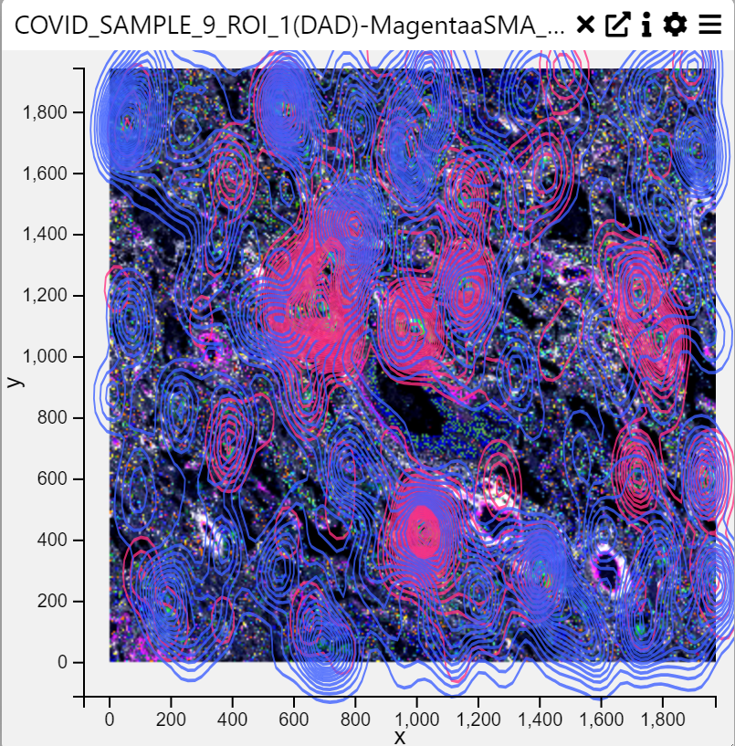
Context
A Density Scatter Plot is a visualization that represents the density of data points in a two-dimensional space. It is useful for identifying clusters, patterns, and relationships between two numerical variables. The density is typically visualized using contours or color gradients.
Inputs
X-axis (numerical variable)
Y-axis (numerical variable)
Category Column (categorical variable, optional for grouping)
Settings
Chart Name (customizable title)
Chart Legend (define or modify legend text)
Point Opacity (adjust transparency of individual data points)
Point Size (set size of data points for better visualization)
Axis Controls
X-axis & Y-axis Selection (choose numerical variables for both axes)
Rotate Y-axis Labels (toggle label orientation for readability)
Y-axis Text Size (adjustable via slider)
Y-axis Width (modify axis width for layout optimization)
Rotate X-axis Labels (toggle orientation for better fit)
X-axis Text Size (adjustable via slider)
X-axis Height (modify spacing to accommodate longer labels)
Color Settings
Color By (choose a variable for color encoding)
Show Color Legend (enable/disable color legend)
SymLog Color Scale (apply logarithmic scaling for better contrast)
Trim Color Scale to Percentile (adjust percentile range for color mapping)
Treat Zero as Missing (exclude zero values from visualization)
Tooltip & Interaction
Show Tooltip (enable or disable tooltip display)
Tooltip Value (choose which information appears in the tooltip)
Centre Plot (reset and centre the visualization)
Filtering & Display
Action on Filter
Hide Points (remove filtered-out points)
Gray Out Points (retain but dim non-selected points)
Background Color
None (default)
White, Light Gray, Gray, Black (set the background color)
Brush Type (Selection method for data)
Free Draw (Allows drawing custom selection areas)
Rectangle (Selects a rectangular area of data)
Contour Settings
Contour Parameter (choose a variable for contour generation)
Contour Categories (up to two categories for subgroup contours)
KDE Bandwidth (adjust bandwidth for kernel density estimation)
Fill Contours (toggle whether to fill density contours)
Fill Intensity (control intensity of the filled contours)
Contour Opacity (adjust transparency of contour lines)
Dot Plot
Examples
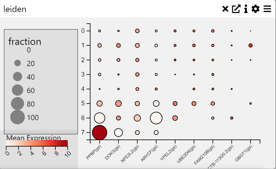
Context
A Dot Plot is a graphical representation where individual data points are plotted along an axis to show frequency distributions, comparisons, or proportions. Each dot represents a value, and its size and color can be used to encode additional information. This chart is useful for visualizing categorical data with quantitative measures.
Inputs
Categories on Y-axis (categorical variable)
Fields on X-axis (numerical or categorical variable)
Settings
Chart Name (customizable title)
Chart Legend (define or modify legend text)
Axis Controls
Rotate Y-axis Labels (toggle label orientation for readability)
Y-axis Text Size (adjustable via slider)
Y-axis Width (modify axis width for layout optimization)
Rotate X-axis Labels (toggle orientation for better fit)
X-axis Text Size (adjustable via slider)
X-axis Height (modify spacing to accommodate longer labels)
Right Y-axis Size (adjust axis size for layout balance)
Data Processing
Cluster Rows (group and order rows based on similarity)
Cluster Columns (group and order columns based on similarity)
Averaging Method
Mean (average value calculation)
Median (middle value calculation)
Color Settings
Show Color Legend (enable/disable color legend)
Log Color Scale (apply logarithmic scaling for better contrast)
Trim to Percentile
No Trim
0.001 (removes extreme values beyond this percentile)
0.01
0.05
Heat Map
Examples
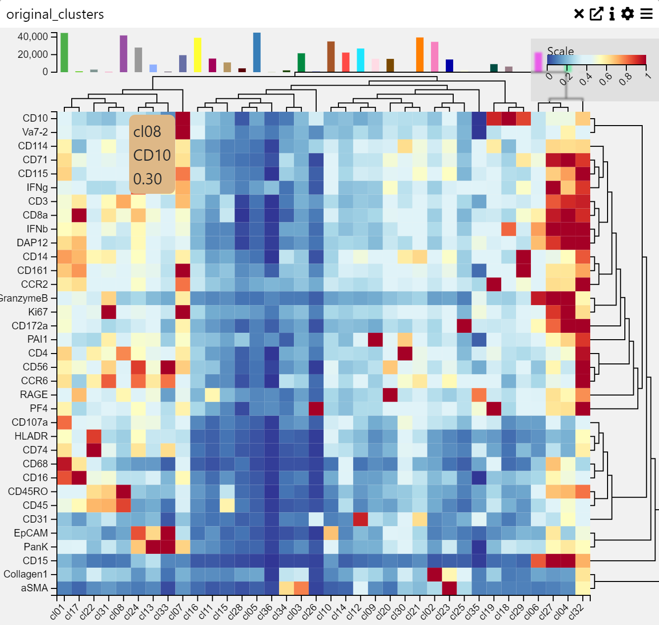
Context
A Heatmap is a data visualization technique that represents values as colors in a matrix format. It is useful for identifying patterns, correlations, and variations across multiple data points. Colors indicate intensity or frequency, making heatmaps effective for comparative analysis.
Inputs
Categories on Y-axis (categorical variable)
Fields on X-axis (numerical or categorical variable)
Settings
Chart Name (customizable title)
Chart Legend (define or modify legend text)
Axis Controls
Rotate Y-axis Labels (toggle label orientation for readability)
Y-axis Text Size (adjustable via slider)
Y-axis Width (modify axis width for layout optimization)
Rotate X-axis Labels (toggle orientation for better fit)
X-axis Text Size (adjustable via slider)
X-axis Height (modify spacing to accommodate longer labels)
Right Y-axis Size (adjust axis size for layout balance)
Data Processing
Cluster Rows (group and order rows based on similarity)
Cluster Columns (group and order columns based on similarity)
Averaging Method
Mean (average value calculation)
Median (middle value calculation)
Color Settings
Show Color Legend (enable/disable color legend)
Log Color Scale (apply logarithmic scaling for better contrast)
Trim to Percentile
No Trim
0.001 (removes extreme values beyond this percentile)
0.01
0.05
Histogram
Examples
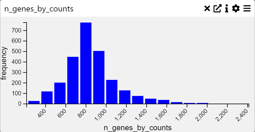
Context
A Histogram is a graphical representation of the distribution of numerical data. It groups values into bins and displays the frequency of occurrences within each bin. This visualization is particularly useful for analyzing the shape, spread, and central tendency of a dataset.
Inputs
Frequency Data (numerical variable to be plotted)
Settings
Chart Name (customizable title)
Chart Legend (define or modify legend text)
Axis Controls
Rotate Y-axis Labels (toggle label orientation for readability)
Y-axis Text Size (adjustable via slider)
Y-axis Width (modify axis width for layout optimization)
Rotate X-axis Labels (toggle orientation for better fit)
X-axis Text Size (adjustable via slider)
X-axis Height (modify spacing to accommodate longer labels)
Data Processing
Max-Min Values (set minimum and maximum range for data representation)
Number of Bins (adjust bin count, min: 2, max: 100)
Multi Line Chart
Examples
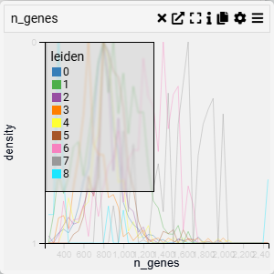
Context
A Line Plot is used to visualize trends and patterns over time or continuous data. It connects data points with lines, making it ideal for identifying increases, decreases, and cyclical patterns.
Inputs
Value (X-axis, numerical variable)
Categories (Y-axis, categorical variable)
Settings
Chart Name (customizable title)
Chart Legend (define or modify legend text)
Change Categories (Y-axis) (select or modify categorical grouping)
Categories to Show (filter displayed categories)
Stack Lines (toggle line stacking for clearer comparison)
Fill Lines (toggle fill area beneath the lines for emphasis)
Axis Controls
Rotate Y-axis Labels (toggle label orientation for readability)
Y-axis Text Size (adjustable via slider)
Y-axis Width (modify axis width for layout optimization)
Rotate X-axis Labels (toggle orientation for better fit)
X-axis Text Size (adjustable via slider)
X-axis Height (modify spacing to accommodate longer labels)
Display & Scale
Scale/Trim to Percentile (adjust the percentile range for data scaling)
Options:
No Trim (default, displays full range)
0.001, 0.01, 0.05 (trim outliers for focused display)
Band Width (adjustable for distribution smoothing)
Intervals (set number of divisions for better data segmentation)
Show Color Legend (toggle visibility of color-coded categories)
Pie Chart
Examples
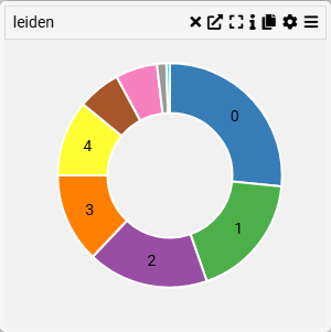
Context
A Category Bar Chart visualizes categorical data distribution, where each category is represented by a bar whose length corresponds to its value. This type of chart is useful for comparing different groups within a dataset.
Inputs
Category (X-axis, categorical variable)
Settings
Chart Name (customizable title)
Chart Legend (define or modify legend text)
Parameters
Category (select the categorical variable to display)
Axis Controls
Rotate X-axis Labels (toggle orientation for readability)
X-axis Text Size (adjustable via slider)
X-axis Height (modify spacing for better label visibility)
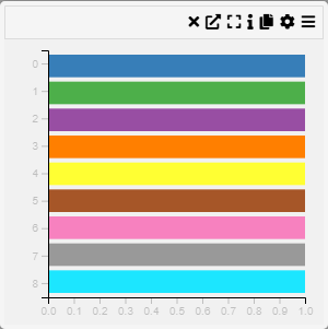
Row Chart
Examples
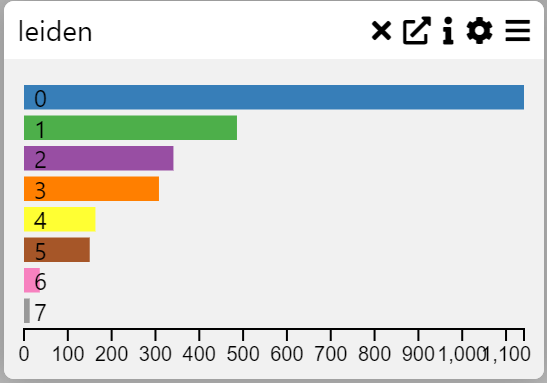
Context
A Row Chart or Category Frequency Chart visualizes the frequency of categorical variables in a dataset. It helps identify patterns and compare the distribution of categories.
Inputs
Category (X-axis, categorical variable)
Settings
Chart Name (customizable title)
Chart Legend (define or modify legend text)
Parameters
Category (select the categorical variable to display)
Axis Controls
Rotate X-axis Labels (toggle orientation for readability)
X-axis Text Size (adjustable via slider)
X-axis Height (modify spacing for better label visibility)
Display Options
Max Rows (limit the number of displayed categories)
Hide Zero Values (option to exclude zero-frequency categories)
Sort Order
Default (original order)
Size (order by frequency)
Name (alphabetical order)
Display as WordCloud (alternative visualization format)
Show Tooltip (enable/disable tooltip for additional information)
Row Summary Box
Examples
Context
A Row Summary Box provides a compact summary of key values for a dataset’s rows. It is useful for quick insights and comparisons between multiple attributes in tabular data.
Inputs
Values to Display (select the numerical variables to summarize)
Settings
Chart Name (customizable title)
Chart Legend (define or modify legend text)
Parameters
Values to Display (choose specific numerical fields to summarize)
Sankey Diagram
Examples
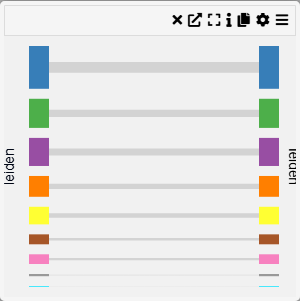
Context
A Group Comparison Chart allows for a visual comparison between two selected categorical groups. This chart is useful for analyzing differences in distributions, frequencies, or statistical summaries across groups.
Inputs
First Group (select the first categorical group)
Second Group (select the second categorical group)
Settings
Chart Name (customizable title)
Chart Legend (define or modify legend text)
Parameters
First Group (choose the primary category for comparison)
Second Group (choose the secondary category for comparison)
Axis Controls
Rotate Y-axis Labels (toggle orientation for readability)
Y-axis Text Size (adjustable via slider)
Y-axis Width (modify width for better label visibility)
Selection Dialog
Examples
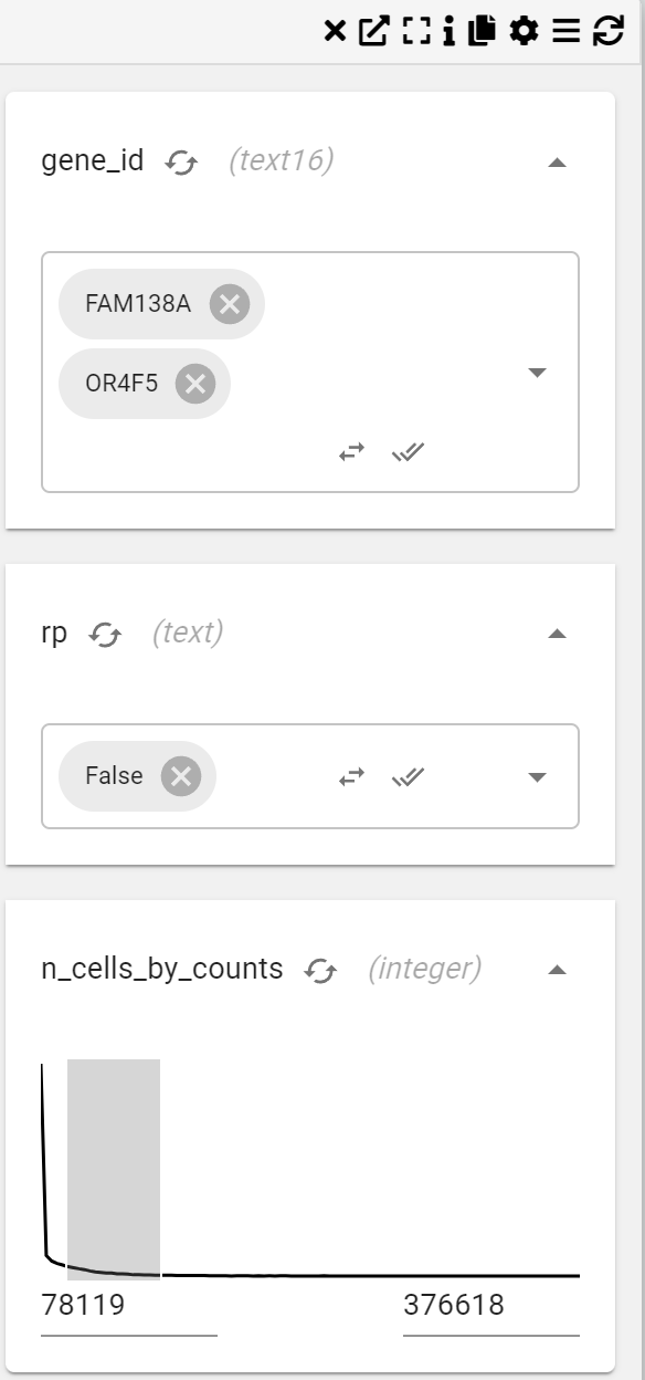
Context
A Selection Dialog or Column Filter Chart enables the selection and filtering of specific columns within a dataset. This chart is useful for focusing on particular variables or subsets of data.
For example, you may want to only show cells that have been derived from a particular disease. Assuming there is a disease column (of data type), You could add a “Disease” filter and that would show a drop down menu containing the disease categories that could be tuned on or off.
If this column was a numeric type, e.g. total_counts (counts of reads per cell) the selection dialogue would show a distribution that can be filtered by dragging a range over the distribution.
Inputs
Columns to Filter (choose which dataset columns should be filtered)
Settings
Chart Name (customizable title)
Chart Legend (define or modify legend text)
Select particular columns to filter
Interactivity
Clear Filters (option to remove applied filters)
Stacked Row Chart
Examples
Context
A Stacked Row Chart or Categorical Heatmap is a visualization that represents data through a color-coded matrix. Each cell in the heatmap corresponds to a category on the X and Y axes, with color intensity indicating the value of the relationship between them.
Inputs
Category (X-axis, categorical variable)
Category (Y-axis, categorical variable)
Settings
Chart Name (customizable title)
Chart Legend (define or modify legend text)
Parameters
Category X-axis (select the categorical variable for the horizontal axis)
Category Y-axis (select the categorical variable for the vertical axis)
Axis Controls
Rotate Y-axis Labels (toggle orientation for readability)
Y-axis Text Size (adjustable via slider)
Y-axis Width (modify axis width for layout optimization)
Rotate X-axis Labels (toggle orientation for better fit)
X-axis Text Size (adjustable via slider)
X-axis Height (modify spacing for label accommodation)
Right Y-axis Size (adjust the width of the right-side Y-axis)
Color & Sorting
Show Color Legend (enable or disable color legend)
Sort Order
Default (maintain the dataset’s natural order)
Size (sort by value size)
Name (alphabetical sorting)
Composition (sort based on composition criteria)
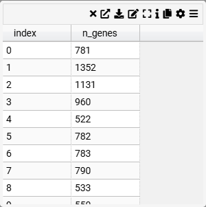
Table
Examples
Context
A straightforward tabular display of data with sorting options. Useful for reviewing raw data.
Inputs
Columns to Display (select the columns to be included in the summary table)
Settings
Chart Name (customizable title)
Chart Legend (define or modify legend text)
Parameters
Columns to Display (choose specific columns such as
n_genes,total_counts,leiden,cell_id, etc.)
Interaction & Filtering
Column Display Modes
Column (display as a standard column)
Link (convert column values to links)
Active Link (interactive linking for dynamic filtering)
Searchable & Sortable (allow sorting and searching within the table)
Text Box
Examples
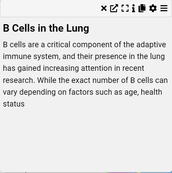
Context
A Text Box is a simple visualization component used to display markdown-formatted text. It is useful for adding descriptions, annotations, or contextual information to a dashboard.
Inputs
Markdown Text (customizable text content with support for markdown formatting)
Settings
Chart Name (customizable title)
Chart Legend (define or modify legend text)
Markdown Text (input area for entering markdown-formatted text)
Features
Supports Markdown Syntax (bold, italics, headers, lists, links, and more)
Resizable (adjust dimensions dynamically)
Customizable Content (allows users to input and modify text as needed)
This component is ideal for adding explanatory notes, instructions, or additional information to enhance the interpretability of data visualizations.
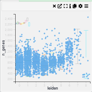
2D Scatter Plot
Examples
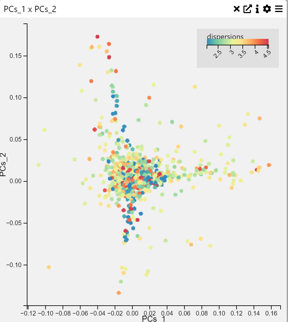
Context
A 2D Scatter Plot and 3D Scatter Plot is a visualization that displays points on a two-dimensional graph to reveal relationships between two numerical variables. Each point represents an observation in the dataset.
Inputs
X-axis (numerical variable)
Y-axis (numerical variable)
Settings
Chart Name (customizable title)
Chart Legend (define or modify legend text)
Point Opacity (adjust transparency of points)
Point Size (modify size of data points)
Axis Controls
X-axis (select a column for X values)
Y-axis (select a column for Y values)
Rotate Y-axis labels (toggle rotation for readability)
Y-axis text size (adjust text size via slider)
Y-axis width (modify width for layout optimization)
Rotate X-axis labels (toggle rotation for better fit)
X-axis text size (adjust via slider)
X-axis height (modify spacing for long labels)
Color Settings
Color By (choose a variable for color encoding)
Show Color Legend (enable/disable legend)
SymLog Color Scale (apply logarithmic scaling)
Trim Color Scale (adjust percentile range for color mapping)
Treat Zero as Missing (ignore zero values in visualization)
Tooltip & Interaction
Show Tooltip (toggle tooltip display)
Tooltip Value (select which data appears in the tooltip)
Centre Plot (reset and center visualization)
Filtering & Display
Action on Filter
Hide Points (remove filtered-out points)
Gray Out Points (dim non-selected points)
Background Color
None, White, Light Gray, Gray, Black
Brush & Selection
Brush Type
Free Draw (polygonal selection)
Rectangle (box selection)
This scatter plot is a powerful way to visualize relationships between variables, detect clusters, and identify outliers in data.
Violin Plot
Examples
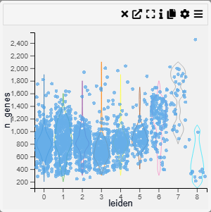
Context
Violin plots combine a box plot with a density plot, illustrating the full distribution shape for each category. Excellent for comparing distributions when you also want to see their shape.
Inputs
Category (X-axis, categorical variable)
Value (Y-axis, numerical variable)
Settings
Chart Name (customizable title)
Chart Legend (define or modify legend text)
Band Width (adjustable width for smoothing)
Intervals (control the number of divisions in the density estimate)
Point Opacity (adjust transparency of individual data points)
Point Size (set size of data points for better visibility)
Axis Controls
Rotate Y-axis labels (toggle label orientation for readability)
Y-axis text size (adjustable via slider)
Y-axis width (modify axis width for layout optimization)
Rotate X-axis labels (toggle orientation for better fit)
X-axis text size (adjustable via slider)
X-axis height (modify spacing to accommodate longer labels)
Color Settings
Color By (choose a variable for color encoding)
Show Color Legend (enable/disable color legend)
SymLog Color Scale (apply logarithmic scaling for better contrast)
Trim Color Scale (adjust percentile range for color mapping)
Treat Zero as Missing (exclude zero values from visualization)
Tooltip & Interaction
Show Tooltip (enable or disable tooltip display)
Tooltip Value (choose which information appears in the tooltip)
Centre Plot (reset and centre the visualization)
Filtering & Display
Action on Filter
Hide Points (remove filtered-out points)
Gray Out Points (retain but dim non-selected points)
Word Cloud
Examples
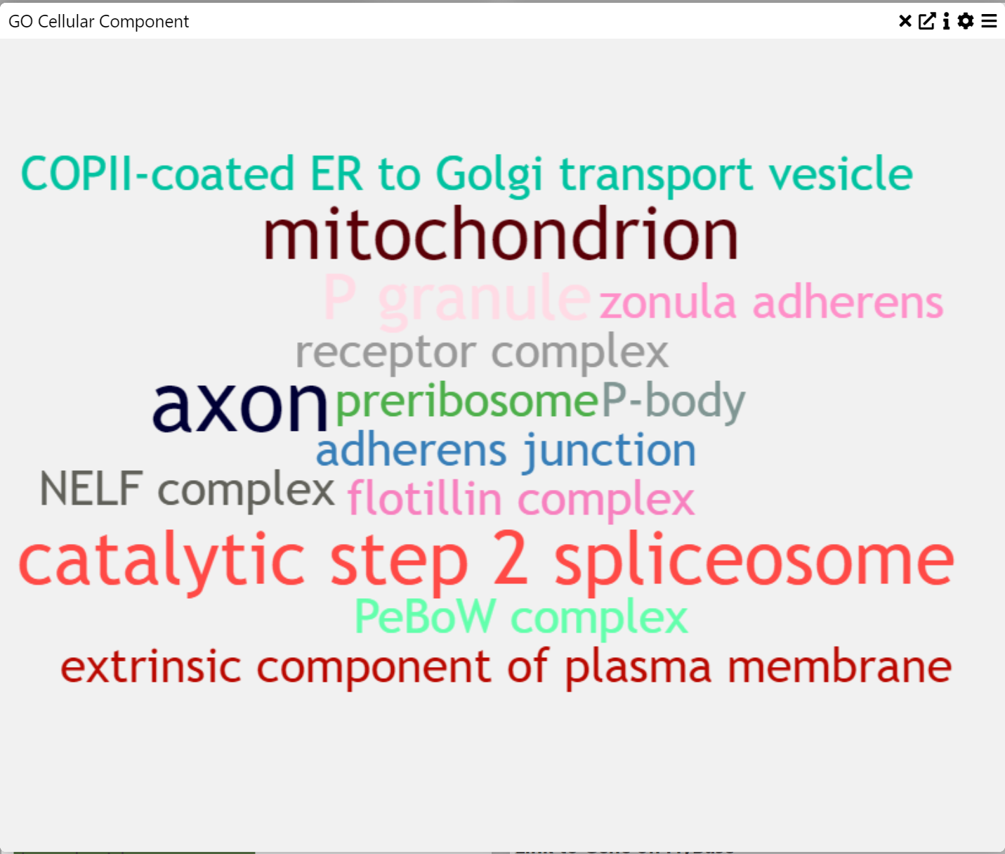
Context
A word cloud is a visual representation of text data where the size of each word corresponds to its frequency or importance. This type of visualization is useful for quickly identifying key themes in a dataset.
Inputs
Text Data (words or phrases from a dataset)
Settings
Word Size (adjust the relative size of words in the visualization)
Exporting Data
When in a Table chart, click the Download icon (⬇️) to export filtered data. Only visible columns are downloaded, so make sure to expand or unhide columns if needed.
Permissions
Two permission levels exist:
View: Users can see the project but not save changes.
Edit: Users can add/change charts, save, and run jobs.
Making a Project Public
Click Share (🔗) → Make Public.
Anyone with the link can now view.
Submitting an Issue
Click Help (❓) → Send Question to message the MDV support mdv@cmd.ndm.ox.ac.uk
Or file an issue on GitHub.
FAQ
Can MDV be viewed on a mobile device?
No. MDV’s interface relies on multiple panels and is optimized for larger screens.
Do I need special packages to load .h5ad files?
No, the server handles AnnData internally. Just upload your file.
What if my file is larger than 2GB?
Use the MDV API or contact support.